I Gave Codex a Figma Design. One Short Prompt Was Enough.
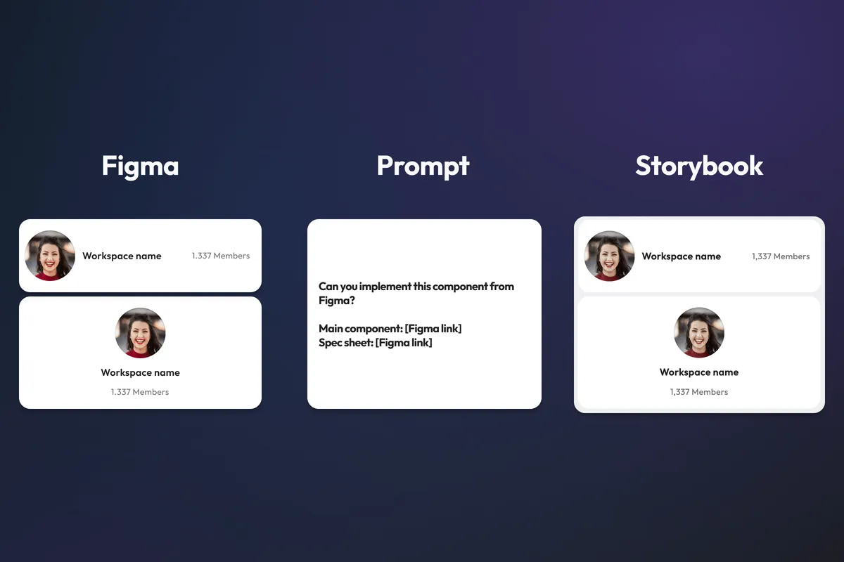
TL;DR: I designed a component in Figma and gave Codex two links and a one-sentence instruction. No component name. No props. No explanation of the variants, layout, spacing or dynamic data. Codex had to figure those things out from the design and the existing codebase. The video below shows the complete implementation.
Generating something that looks like a Figma design isn't particularly interesting anymore.
Give an AI agent a screenshot, enough freedom to write HTML and CSS, and there's a reasonable chance it will produce something visually similar.
I've tried that before.
The results were disappointing.
The component might look approximately right in isolation, but the implementation didn't look like the rest of the codebase. Custom CSS recreated behavior that already existed in the design system. Existing components weren't used correctly. Layout decisions were made locally instead of following established patterns.
It looked like the design.
It didn't look like our code.
So I wanted to try something different.
Instead of testing whether Codex could reproduce pixels, I wanted to see whether it could understand how we build software.
The experiment
I created a new Workspace Card in Figma.
It has a workspace logo, a name, a member count and two different layouts.
But I deliberately included several details that make the implementation less obvious than the final design suggests.
Then I gave Codex this prompt:
Can you implement this component from Figma?
Main component: Figma link Spec sheet: Figma link
That was it.
I deliberately didn't tell Codex the component name.
I didn't define any props.
I didn't explain which Vuesion components had been used in Figma.
I didn't tell it how the number should be formatted.
I didn't explain how the two layouts should be implemented.
And I didn't tell it that I expected the implementation to work without custom CSS or duplicated markup.
Those things were the test.
Challenge 1: Figure out what the component actually is
The first challenge was intentionally basic.
I never told Codex that it was implementing a WorkspaceCard.
It had the main Figma component and the spec sheet, and had to understand the design well enough to determine what it represented and how that concept already existed in the codebase.
The same applied to the content.
The design contains a workspace name and a member count, but I hadn't configured either of them as Figma component properties.
To Figma, those could just as easily have been static strings.
Codex had to recognize that they represented dynamic domain data and translate that into an API for the Vue component.
It ended up with:
interface WorkspaceCardProps {
  name: string;
  memberCount: number;
  logoSrc?: string | null;
  look?: 'horizontal' | 'vertical';
}
I could also imagine passing an existing WorkspaceListView domain type directly to a domain component like this.
But I wouldn't consider either approach wrong.
Individual props make the component slightly more flexible, and more importantly, Codex correctly understood that the values in Figma weren't the data model.
They were one rendering of that data.
Challenge 2: Recognize the existing design system
The next challenge was identifying what the design was made from.
The card wasn't supposed to become a new pile of HTML and CSS.
Most of its visual language already exists in Vuesion: typography, colors, spacing and layout primitives.
Codex had to inspect the Figma design, inspect the existing codebase and connect the two.
This is where my earlier experiments without dedicated skills had gone wrong.
Codex could reproduce the pixels, but it would often solve the problem locally with custom CSS. The resulting component might work, but it didn't feel like something that belonged in the codebase.
This time, Codex had access to Vuesion's Figma implementation, Figma design-to-code, design system and testing skills.
The difference was substantial.
Instead of inventing a local implementation, it used the existing language of the system.
Challenge 3: One component, two fundamentally different layouts
The Workspace Card has two variants.
The first is horizontal.
The second is vertical.
In Figma, this is straightforward. One uses horizontal Auto Layout and the other vertical Auto Layout.
In code, however, there are several ways to reproduce that appearance.
The obvious solution isn't necessarily the one I wanted.
Codex could have created two separate pieces of markup and switched between them depending on the look prop.
That would have matched the design.
It also would have duplicated most of the component.
Another option would have been to use a generic flex layout and add custom styling until both versions happened to look correct.
Again: visually acceptable, architecturally wrong for this codebase.
What I wanted was the same thing I would expect from an engineer on the team: understand the available layout primitives and find a composition that can express both variants without duplicating the component.
Codex did exactly that.
It used the existing layout system to switch the composition between horizontal and vertical while keeping the content structure shared.
This sounds like a small detail.
It isn't.
Reusing layout primitives means less code, fewer places that can drift apart and fewer special cases to maintain later.
It's also something humans get wrong surprisingly often.
Challenge 4: Notice that 8 pixels matter
I deliberately added another inconsistency between the variants.
The vertical version uses 16 pixels of padding where expected.
The horizontal version doesn't.
On its left side, it uses 8 pixels.
I didn't mention this in the prompt.
There was no instruction saying:
Be careful, the padding changes between variants.
Codex had to notice it in Figma and express that difference using the existing design-system API.
This was one of the details I was most interested in.
A system that merely recognizes "this is a card" could easily apply the same spacing everywhere and produce something that looks close enough at first glance.
But implementation from a design isn't about getting approximately the right structure.
The details are part of the specification.
Codex picked up the difference without me pointing it out.
Challenge 5: Understand that 1,337 Members isn't a string
This was probably my favorite hidden test.
The Figma design shows a formatted member count.
Again, it wasn't configured as a property.
I never told Codex that memberCount should be a number.
And I never explained how Vuesion handles number formatting or pluralization.
A naive implementation could easily turn the value visible in Figma into a string prop.
Something like:
members: string;
That would reproduce the design.
It would also completely miss the behavior behind it.
Codex instead created:
memberCount: number;
and rendered it using the existing internationalization setup:
{{ $n(memberCount) }} {{ $t('common.Member' /* Member | Members */, memberCount) }}
That means the number isn't hardcoded in its visual representation.
It uses the application's number formatting.
And Member versus Members follows the existing translation and pluralization mechanism.
This is exactly the kind of detail I care about.
Figma contains the output.
The implementation needs to understand the behavior that produces that output.
Challenge 6: Don't solve design-system problems with custom CSS
I didn't explicitly tell Codex not to write custom CSS.
That was intentional.
If a codebase already has primitives for typography, spacing, layout and component composition, I don't want every feature to recreate those decisions locally.
This was one of the biggest differences between my earlier experiments and this one.
Without enough context about the codebase, AI-generated implementations tended to solve whatever was visible directly.
Need spacing? Add CSS.
Need a layout change? Add CSS.
Need a visual variant? Add another local rule.
That approach can produce convincing screenshots surprisingly quickly.
It also produces a codebase I don't want to maintain.
This time, the implementation expressed the design using the existing Vuesion system instead.
That's a much harder test than matching the pixels.
Challenge 7: Follow the existing development workflow
Implementing the .vue file wasn't the whole task.
Vuesion already has a component generator and established conventions around components, tests and Storybook.
Codex found and used them.
The generator created the expected structure:
WorkspaceCard.vue
WorkspaceCard.spec.ts
WorkspaceCard.stories.ts
It then implemented the component, added the relevant tests and Storybook stories, and ran the checks.
But it went one step further that I hadn't explicitly requested.
It started Storybook.
Then it visually inspected both variants to verify that its implementation actually looked the way it expected.
I only had to confirm once or twice that it was allowed to open Storybook.
I didn't correct the implementation.
There was no second implementation prompt.
No "please use this component instead."
No "the spacing is wrong."
No "don't duplicate this."
The initial prompt produced the final implementation.
The result
The result was, for practical purposes, exactly how I would have implemented the component myself.
That's a more meaningful benchmark to me than whether an AI can produce something visually impressive.
If someone had shown me the final implementation in a pull request without telling me who wrote it, I wouldn't have identified it as AI-generated code.
There are two decisions I could reasonably have made differently.
The first is the component API.
Codex generated individual props:
interface WorkspaceCardProps {
  name: string;
  memberCount: number;
  logoSrc?: string | null;
  look?: 'horizontal' | 'vertical';
}
For a domain component, I also would have been perfectly happy with something closer to:
interface WorkspaceCardProps {
  workspace: WorkspaceListView;
  look?: 'horizontal' | 'vertical';
}
Neither is inherently better here.
The second difference was in the Storybook story.
Codex downloaded the avatar asset used in Figma and stored it locally at:
src/public/images/storybook/workspace-card-avatar.png
That works.
But it introduced a pattern that doesn't otherwise exist in the codebase. I normally use a placeholder image service for assets like this in stories.
That's probably the one thing I would change.
And I think it's important to say that.
The implementation wasn't magically perfect because an AI wrote it.
It was simply good enough that the remaining differences were the same kind of minor decisions I might discuss on a normal pull request.
The interesting part wasn't Codex
It's tempting to look at this experiment and conclude that AI models have simply become much better at implementing Figma designs.
They have.
But I don't think that's the most interesting explanation for what happened here.
I've tried versions of this before.
Without the right skills and codebase context, the results were much worse.
Codex would recreate existing behavior with custom CSS. It would miss established patterns. The component might resemble the Figma design while looking nothing like the components surrounding it in the repository.
The model wasn't necessarily incapable of writing better code.
It didn't know what better code meant in this codebase.
That's a very different problem.
Most of the decisions had already been made
When Codex implemented the Workspace Card, it wasn't starting from an empty repository.
The design system already existed.
The layout primitives already existed.
Typography and colors already had names.
Component structure had conventions.
Testing had conventions.
Storybook had conventions.
The component generator encoded part of the expected file structure.
Internationalization and number formatting already had established patterns.
And the Vuesion skills explained how those pieces were supposed to be used together.
Codex still had to reason.
It had to recognize what it saw in Figma, inspect the codebase, find the relevant abstractions and apply them correctly.
But the space of reasonable decisions was dramatically smaller.
That's the same thing I've tried to achieve for human engineers for years.
A developer joining a consistent codebase shouldn't need to invent how the next feature is structured.
They should be able to look around, understand the patterns and spend their attention on what's actually new.
AI agents benefit from exactly the same thing.
Good code should be the easiest code to generate
I don't think the future of AI-assisted development is about writing increasingly detailed prompts explaining exactly how every feature should be implemented.
That would just move the work from writing code to writing instructions about code.
The more interesting direction is the opposite.
Give the agent less feature-specific instruction because the environment already contains the answers.
The codebase provides examples.
The design system provides a visual language.
Generators encode repetitive patterns.
Tests provide feedback.
Skills explain conventions that aren't obvious from code alone.
Figma provides the design specification.
And the agent connects those things.
The goal isn't to give an agent enough instructions to generate good code.
The goal is to build a codebase where good code is the easiest code to generate.
That's why the pixels weren't really the test.
Matching the Figma design was necessary.
But the result I actually cared about was much simpler:
Does this look like code our team would have written?
In this case, the answer was yes.
And that's where AI-assisted development starts becoming genuinely interesting.
This is how I build Vuesion
These aren't just ideas I write about. They're principles I've been building into Vuesion for more than eight years.